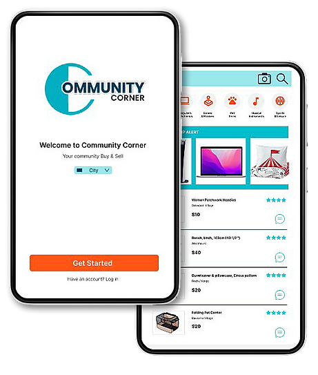
Used Clothing App for Local Community - Community Corner
Community Corner is an app to help people find used clothes or items in their close-by communities. Target users are people living in different communities who are too busy to shop around stores in person.
Duration. Dec 2023 - Feb 2024
City. Toronto
Sample Size. 5 ppl
Role. UX designer and UX researcher

UX UI BRANDING APPLICATION DESIGN UX RESEARCH CASE STUDY
BACKGROUND.
Community Corner app was created as my 1st project in the Google UX Cert. course. We were asked to select a problem and create a digital product that gives a solution.
Once I started my research, I found there are very limited apps available on the market which target for the people living in remote cities who has the needs in used clothings. The options, features are also very limited on the existing ones. Then I designed the Community Corner App and thinks it can help to improve the current situation and meet the needs of people living in remote areas.
THE PROBLEM.
People of different communities living in remote areas who are too busy to shop around stores in person to buy clothes for their children or themselves; because driving to used clothing stores takes too much time and does not fit his/fer schedule.
THE GOAL.
The Community Corner App connects people in different communities by offering easy, intuitive functions, creating enjoyable buying & selling experience for busy community users. The goal is to help them saving time & fit their own schdule by letting users buy & sell online within their own community.
USER RESEARCH.
In order to understand the problem, I conducted a survey by Google Forms with 5 people who live in remote areas. Below are their common pain points to the existing situation.
"I can't find what I want in my living area, but I don't have time to drive & shop!"
"Variety in my living area is too limited,
I don't like long drive."
"I'm too busy to go shop clothing for my kids & myself,
I don't like the existing online stores whatever on price/variety"

STORYBOARD &WIREFRAME SKETCHES

LO-FI PROTOTYPE

USABILITY STUDY FINDINGS
-
Prices should be indicated on each screen for each item and let users preview the prices before further actions.

Before
After
-
More item screens should be added according to No. of category to complete the whole flow.

Before
After
TAKEAWAYS.
Different users have different needs but their common goal is to fulfil their needs throughout the tools - whatever it is on web, app or other platforms. The most important is we can help them to solving problems and provide them with an enjoyable user experience by fulfilling their actual needs in any upcoming projects.


