Used Clothing Store for Local Community - Community Corner

Community Corner is a website to help people find used clothes or items in their close-by communities. Target users are people living in different communities who are too busy to shop around stores in person.
Duration. Feb 2024 - Apr 2024
City. Toronto
Sample Size. 5 ppl
Role. UX designer and UX researcher
UX UI BRANDING APPLICATION DESIGN UX RESEARCH CASE STUDY
BACKGROUND.
Community Corner Website was created as my 2nd project in the Google UX Cert. course. We were asked to create a website complementing the app in the1st project - Community Corner App.
Same situation as the app, there are very limited websites available on the market which target for the people living in remote cities who has the needs in used clothings. The options, features are also very limited on the existing ones. Then I designed the Community Corner Website and thinks it can help to improve the current situation and meet the needs of people living in remote areas.
THE PROBLEM.
People of different communities living in remote areas who are too busy to shop around stores in person to buy clothes for their children or themselves; because driving to used clothing stores takes too much time and does not fit his/fer schedule.
THE GOAL.
The Community Corner Website helps users buy & sell online (as an assistant platform to the app) by offering them more effective & intuitive ways to connect in their own communities.The ultimate goal is to help people in different communities saving time & fit their own schdule. Meanwhile enhance the communications and promote the community relationship.
USER RESEARCH.
In order to understand the problem, I conducted a survey by Google Forms with 5 people who live in remote areas. Below are their common pain points to the existing situation.
"Shopping website
designs are often too busy, which results in confusing navigation."
"Small buttons on
shopping websites make item selection difficult, which sometimes leads users to make mistakes."
"Existing shopping websites don’t provide an engaging browsing experience."

WIREFRAME SKETCHES

USABILITY STUDY FINDINGS
-
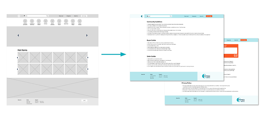
More info should be included in the Footer Part to give users more precise info about the website.

Before
After
-
Contact info at the support page with high contrast color to enhance customer support.
-
Extra link with bigger logo to Homepage also included.

Before
After
NEXT STEPS.
-
Conduct follow-up usability tests on the new website and the app( if necessary).
-
Identify any additional areas of need and ideate on new features for further improvements.

